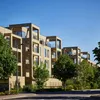
Challenge
Our brief was to develop designs for, and deliver, two parcels of land within the broader masterplan; Darwin Green has its own neighbourhood centre and school to the immediate south. Cambridge City Council has a reputation for innovative development, and our client shares this aspiration to create high quality new homes in this emerging community. We identified an opportunity to enrich the existing outline plan and create a diverse, characterful community.

Concept diagram

The primary street forms the spine of the development
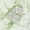
Proposed site plan
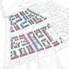
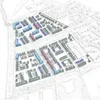
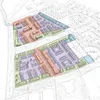
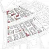
Building typologies and heights, character areas and marker buildings for wayfinding were all explored in developing the proposals
Main moves
Historically, the land to the north of central Cambridge was used for growing food for the city, with nurseries, allotments and fruit growing, and some of these old land uses have been incorporated into the plan. We focused on improving the site’s permeability but also gave it more texture and grain, marking the main axes and creating smaller tertiary routes to break down the block size. The massing is arranged so that larger, more dense apartment blocks sit alongside the more ‘urban’ spine through the middle of the site, transitioning at the edges of the site to a more suburban scale. We wanted to amplify the landscaping; an integral part of our approach was to build upon the provision in the outline plan, with the creation of pocket gardens, parks and allotments.

Woodhouse Green community garden and orchard

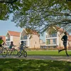
Weavers Place – a car-free space with opportunities for socialising and doorstep play
Detail
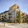
Our strategy was to use familiar materials and techniques, allowing us to take advantage of our client’s sophisticated supply chain, and to detail them in contemporary ways. We worked to create a family of typologies that work well together to define the neighbourhood, while bringing interest and variety. Dormer windows, for example, are employed across the scheme to create a consistent profile. We built in instinctive wayfinding by introducing features such as corner windows on main junctions, marking urban moments and thresholds with a contrast of materials, and bookending streets with a roof pitch or change of level.
Wellbeing
Our focus throughout has been on the human scale. We made as many routes as possible car-free, and there is little on-street parking, with designated car park areas screened by planting. As a way of encouraging residents to feel a sense of pride and personal investment in their landscape, we introduced ‘edible streets’ planted with fruit, as well as allotments throughout the site. The design also includes mews streets so that children can play safely at the doorstep of their homes.

